Refined, Reworked, Reimagined
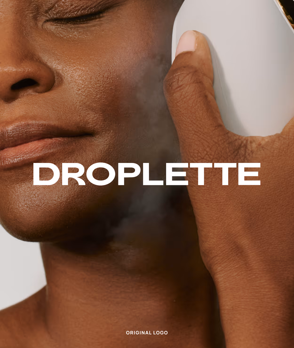
Droplette approached me following a recent rebrand, looking to refine and extend their new visual identity. While the foundation was in place, the existing logo felt too masculine and didn’t fully reflect the brand’s ethos of softness, innovation, and skin-first science. Their internal materials also lacked consistency, creating a need for a flexible, elevated system that could standardize and scale across presentations and social touchpoints.
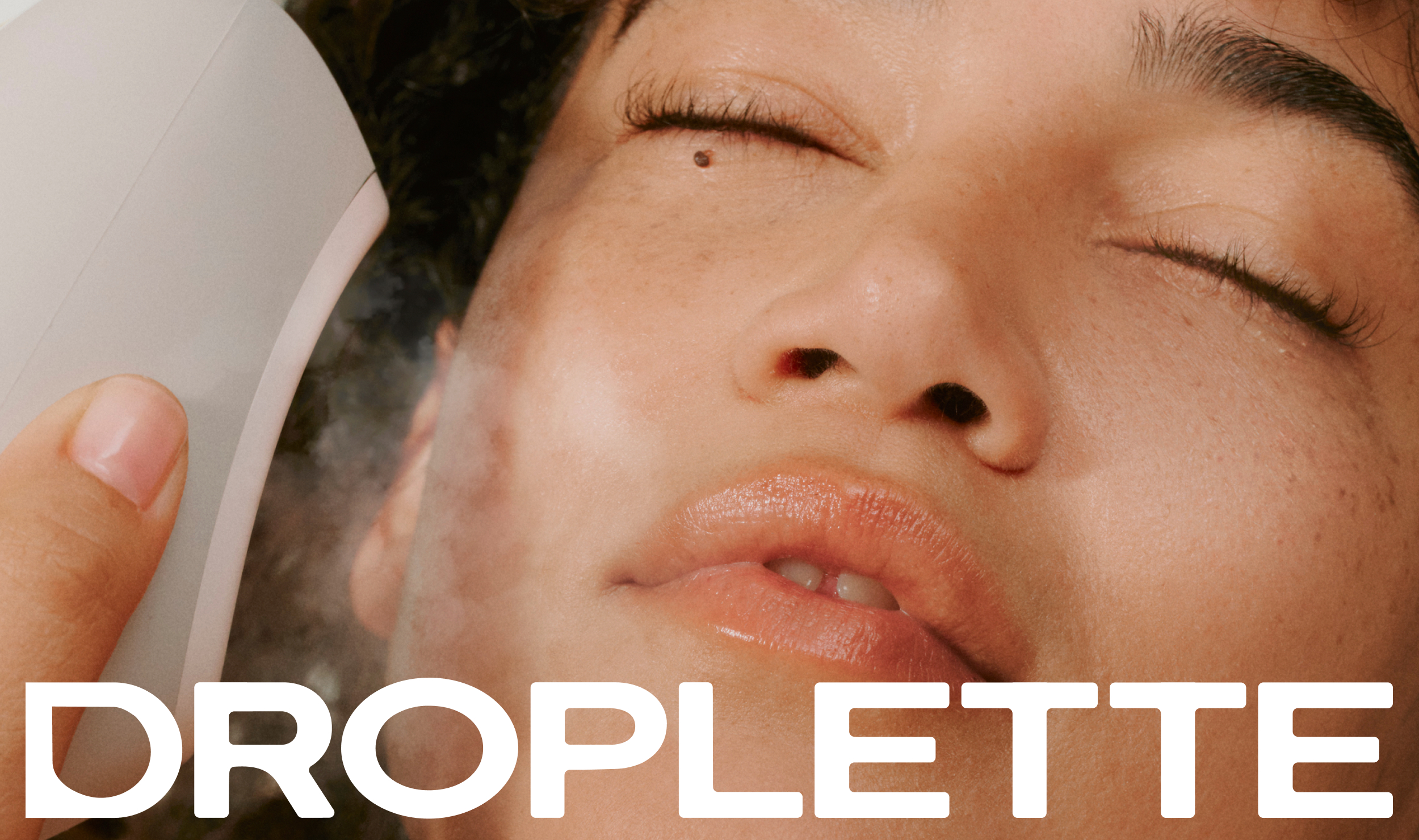
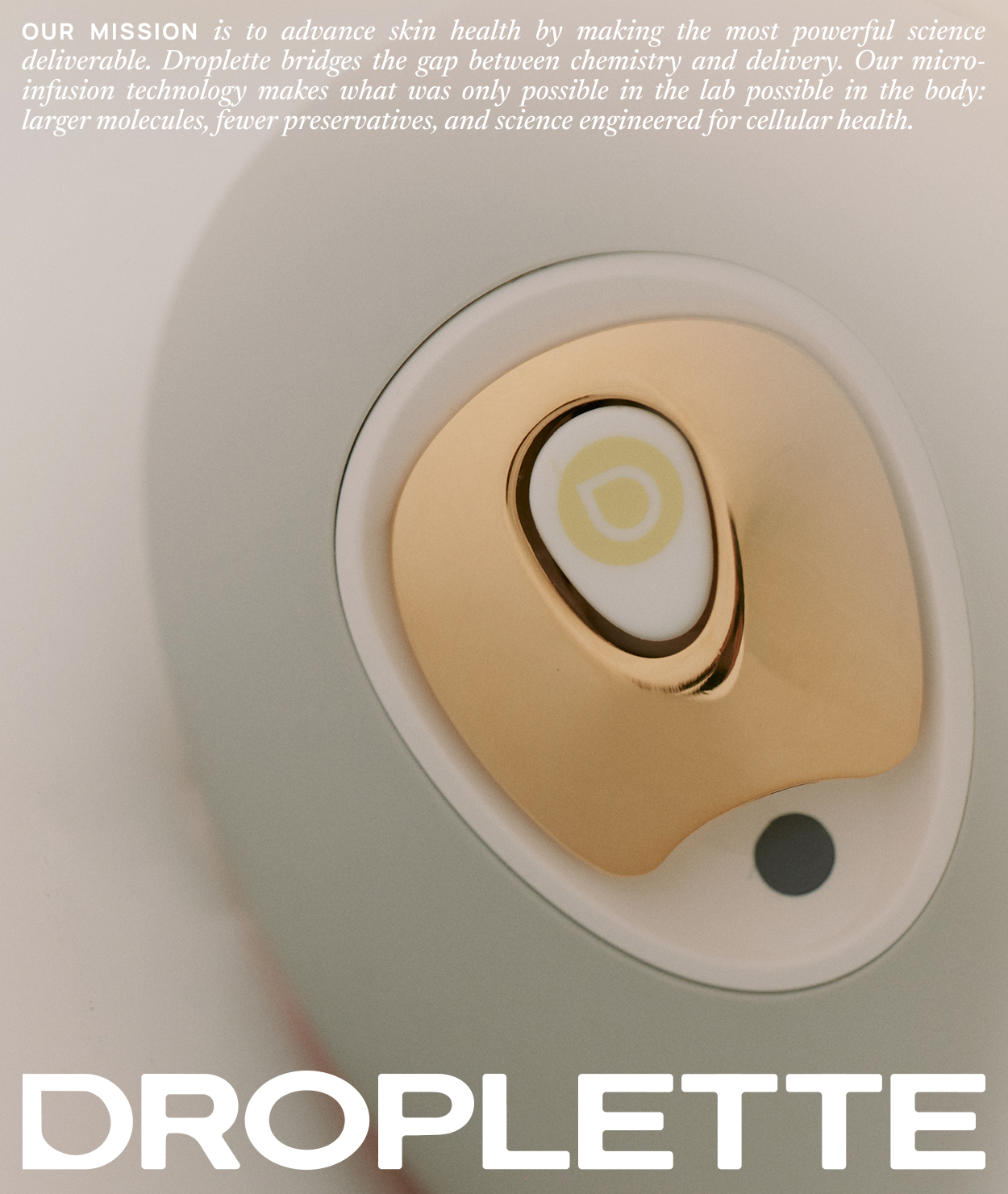
My approach focused on softening and refining the visual language while preserving the integrity of the new brand direction. I began by refining the logo, applying subtle corner radii to the characters to introduce a more approachable, fluid feel. I also integrated Droplette’s signature water droplet symbol into the “D,” creating a more cohesive and ownable mark that felt intrinsically tied to the brand.
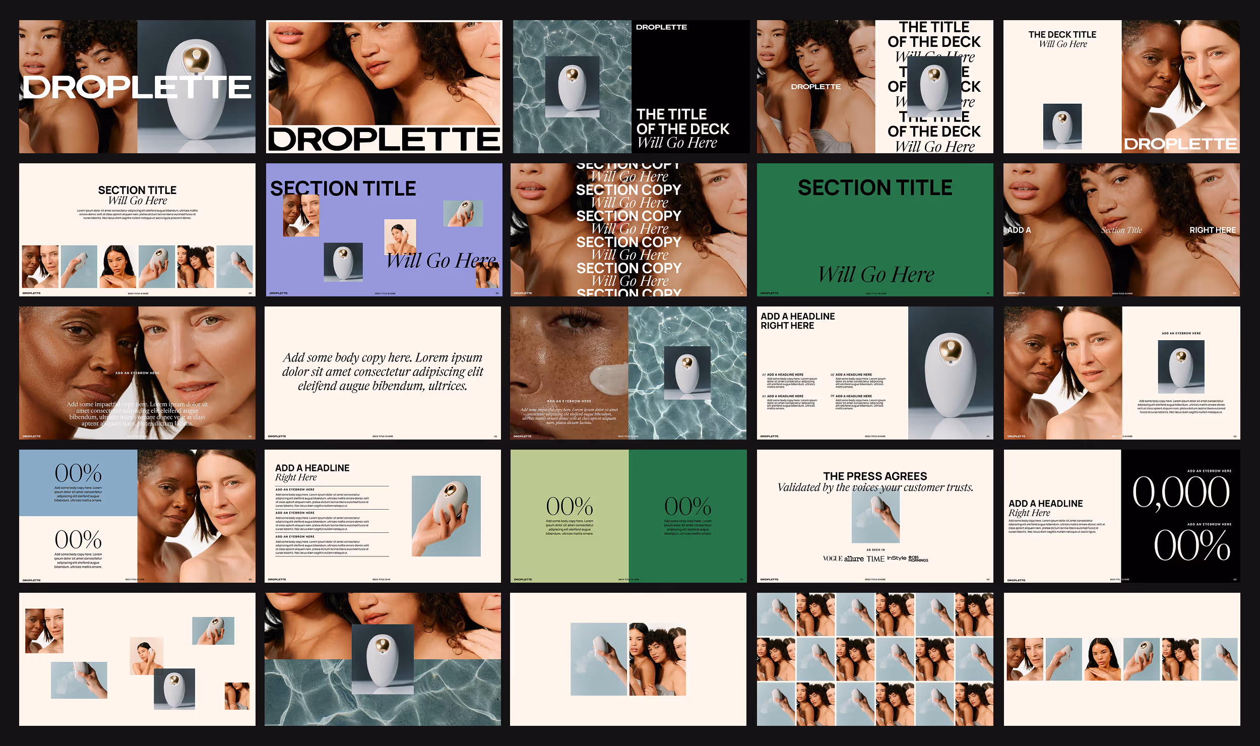
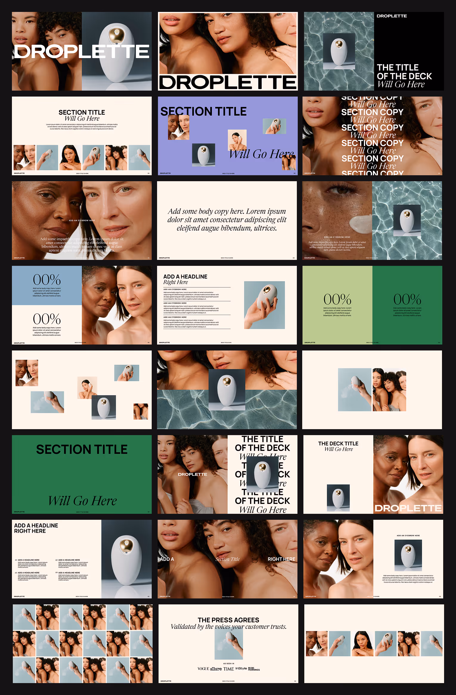
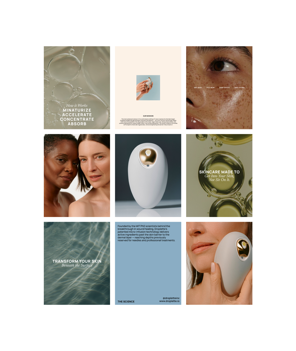
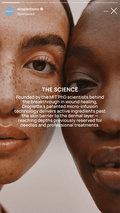
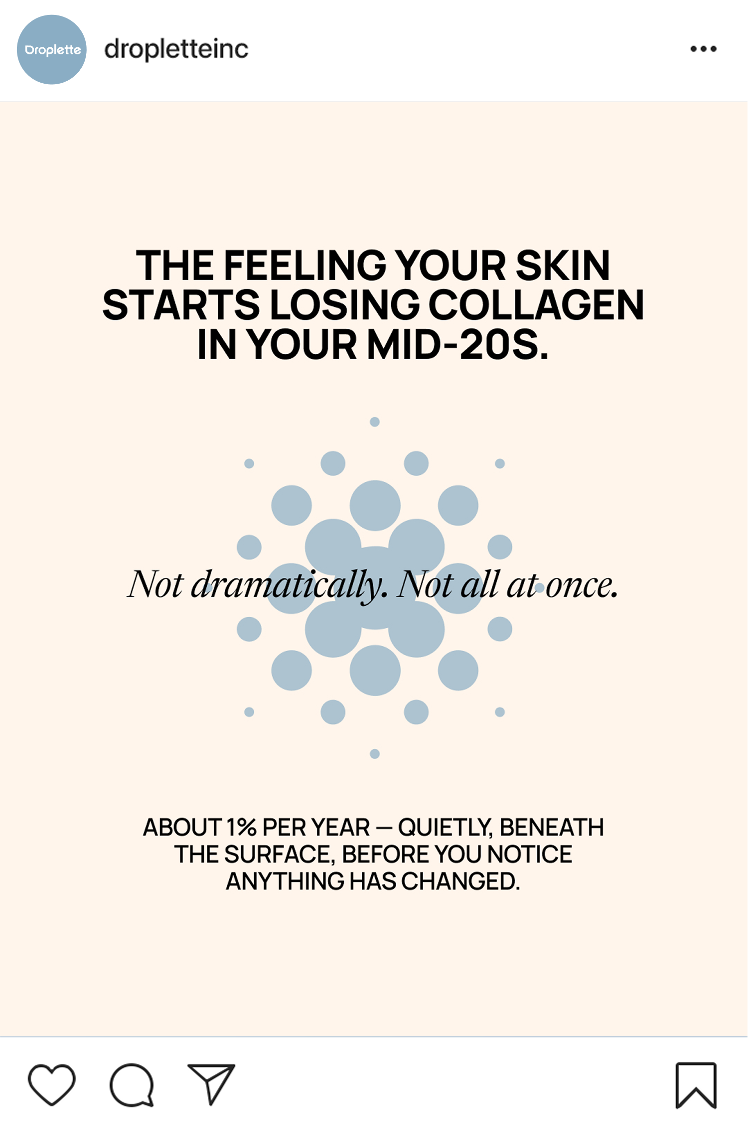
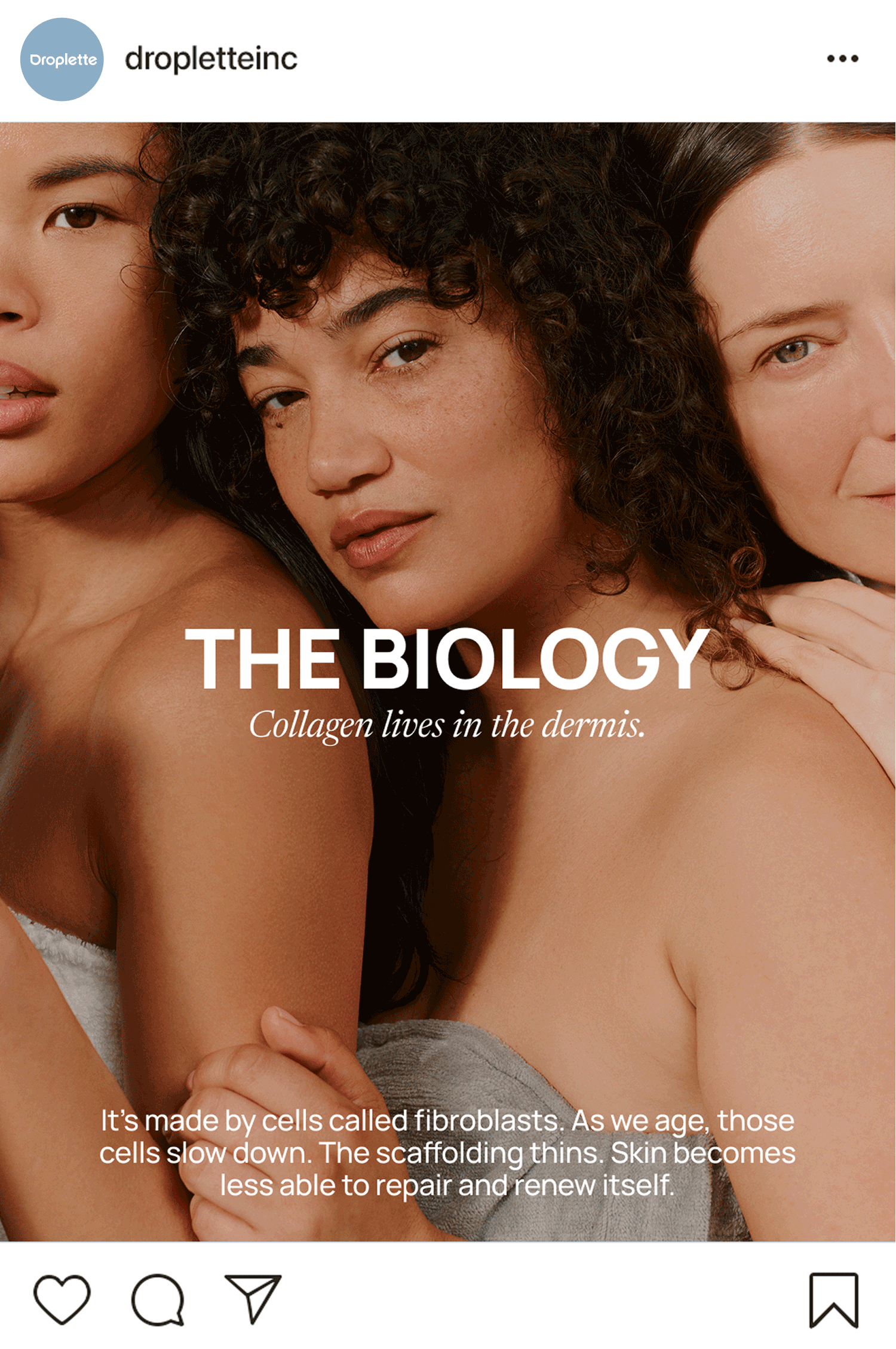
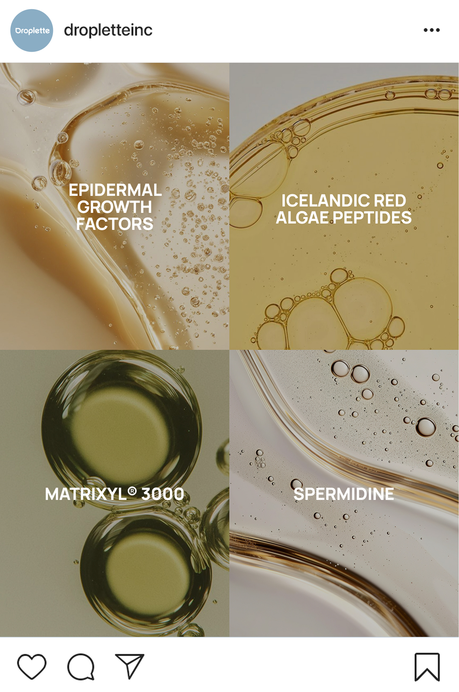
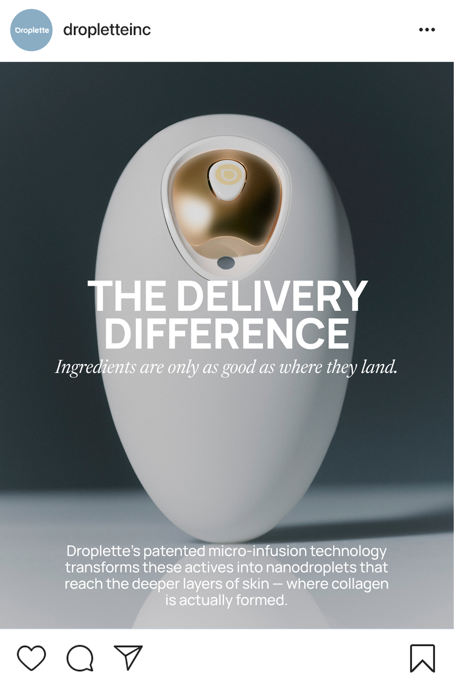
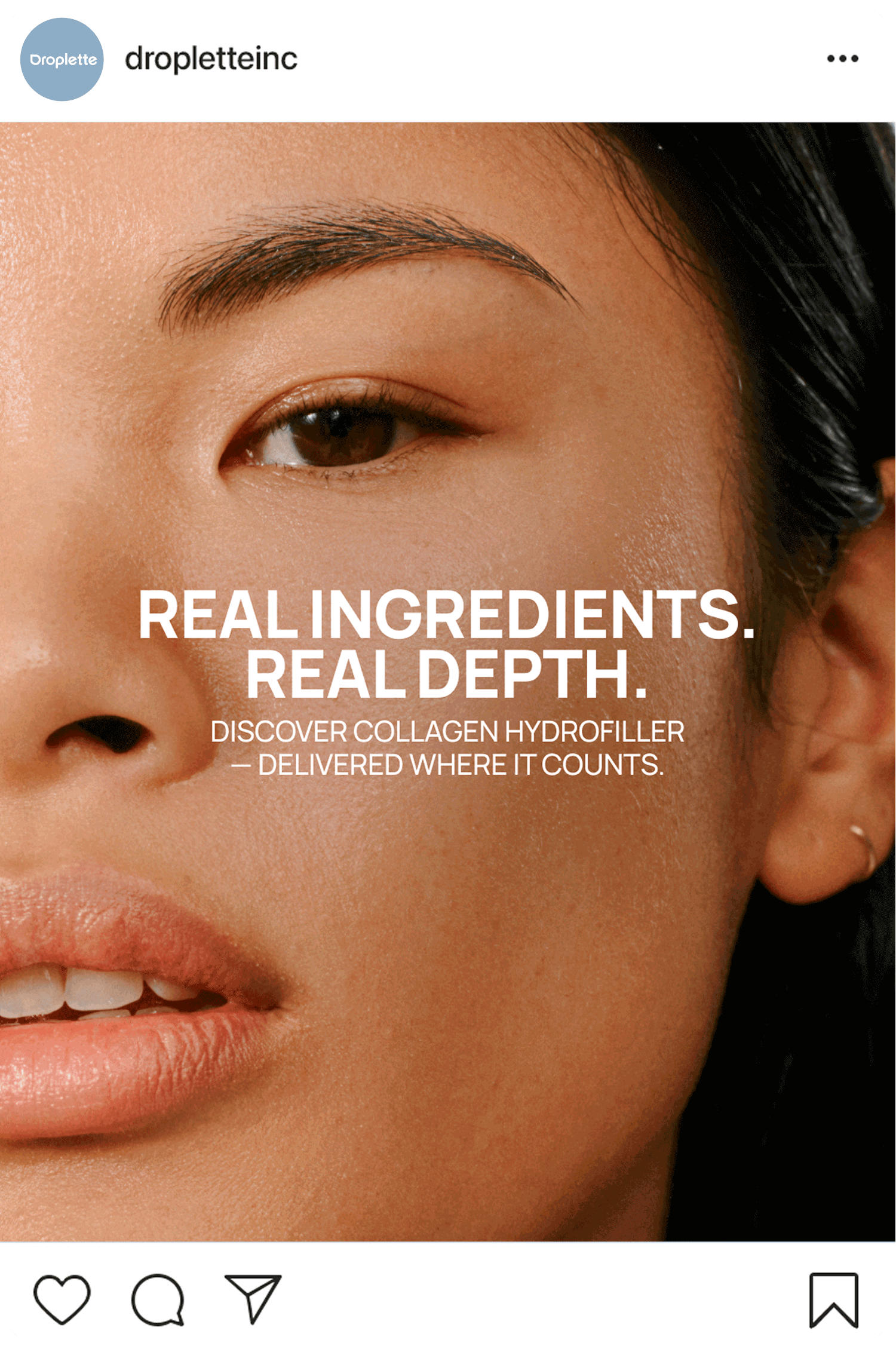
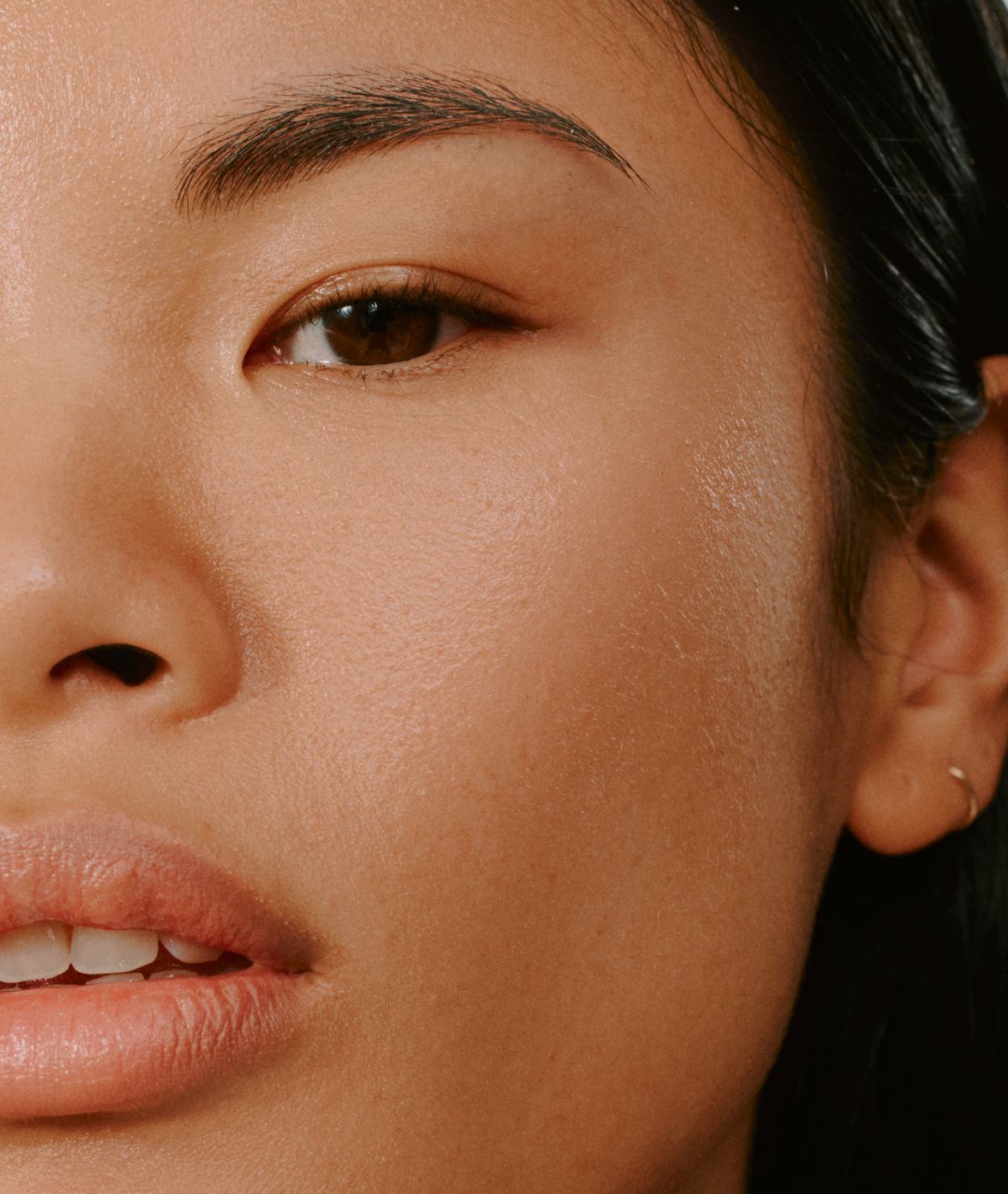
From there, I developed a presentation deck system inspired by editorial design principles, treating each slide as a composition rather than a template. I established a clear typographic hierarchy, pairing structured layouts with moments of asymmetry to create a sense of rhythm. Color was used intentionally to balance clinical innovation with warmth, drawing from the brand’s palette to create contrast and visual interest while maintaining cohesion. Photography also played a central role, blending product-focused imagery with soft, skin-forward visuals and abstract images of water texture to reinforce both the science and sensori experience of the brand.
The result is a flexible, design-forward system that elevates Droplette’s communications, bringing consistency, clarity, and a more refined expression of the brand.